Mastering Color Theory in Fashion Design: A Comprehensive Guide
When it comes to fashion design, color is one of the most powerful tools at your disposal. It can make or break a design, turning a good concept into something extraordinary or leaving it flat and uninspired. To ensure your designs resonate and communicate your vision effectively, understanding color theory is essential. This guide will walk you through the foundational concepts and practical applications of color theory in fashion design.
Understanding the Basics: The Color Wheel

The color wheel is a fundamental tool for fashion designers. It visually represents the relationships between different colors and helps in choosing harmonious color combinations. The color wheel consists of:
-
Primary Colors: Traditionally, these are Red, Yellow, and Blue (RYB). However, there's ongoing debate about what constitutes primary colors, with alternatives like CMYK (Cyan, Magenta, Yellow, and Black) and RGB (Red, Green, Blue) often used depending on the medium. For instance, RGB is ideal for digital designs, while CMYK is used for printed materials.
-
Secondary Colors: Created by mixing two primary colors. The secondary colors are Green, Orange, and Violet.
-
Tertiary Colors: These are formed by mixing a primary color with a secondary color. Examples include Blue-Green, Yellow-Green, Yellow-Orange, Red-Orange, Red-Violet, and Blue-Violet.
Value, Saturation, and Temperature
To work effectively with color, it's crucial to understand three key concepts:
-
Value: This refers to the lightness or darkness of a color. High-value colors are lighter, while low-value colors are darker. Value is crucial in creating contrast and depth in your designs.
-
Saturation: Saturation measures the intensity or purity of a color. A highly saturated color is vivid and strong, while a desaturated color is muted or dull.
-
Temperature: Colors are also classified by temperature, with the wheel split into warm and cool colors. Warm colors (Red, Yellow, Orange) evoke energy and warmth, while cool colors (Blue, Green, Purple) suggest calm and relaxation. Understanding color temperature is vital when creating mood and atmosphere in your designs.
Shades, Tints, Tones, and Mutes
Color manipulation is key to creating depth and variety in your designs. Here’s how you can adjust colors to achieve different effects:
-
Tints: Created by adding white to a color, tints lighten and soften the original hue.
-
Shades: Produced by adding black to a color, shades darken the hue, creating a more intense and dramatic effect.
-
Tones: Formed by adding gray to a color, tones mute the original hue, reducing its intensity and making it more versatile.
-
Mutes: Mutes are created by combining a color with its complement (the color directly opposite on the color wheel). This creates a more subdued version of the color.

The Impact of Undertones
When adjusting colors through tints, shades, tones, and mutes, it's important to consider the undertone of the base color. For example, a warm undertone (like adding a warm white) will enhance the warmth of an orange, while a cool undertone (like adding a cool black) might soften it. Understanding and manipulating undertones can help you achieve the exact mood and aesthetic you’re aiming for.
Practical Applications in Fashion Design
When designing clothing, you’ll use color extensively—not just in choosing fabrics, but in every aspect of your design process. Here’s how to apply color theory in your work:
-
Choosing a Color Palette: Start with the color wheel to create a palette that’s harmonious and aligned with your design’s mood and purpose. Consider complementary colors for contrast or analogous colors for a more cohesive look.
-
Communicating with Industry Professionals: When discussing your designs with manufacturers, retailers, or fellow designers, use accurate color language. This ensures that everyone involved understands your vision and can execute it effectively.
-
Adapting to Trends: Fashion trends often revolve around specific color schemes. Understanding color theory allows you to adapt to these trends while still maintaining your unique style.
Conclusion
Color theory is an indispensable part of fashion design. By mastering the concepts of the color wheel, value, saturation, temperature, and color manipulation, you can elevate your designs and communicate your ideas more effectively. Whether you’re creating a bold statement piece or a subtle, everyday look, understanding how to use color will help you achieve your creative vision.
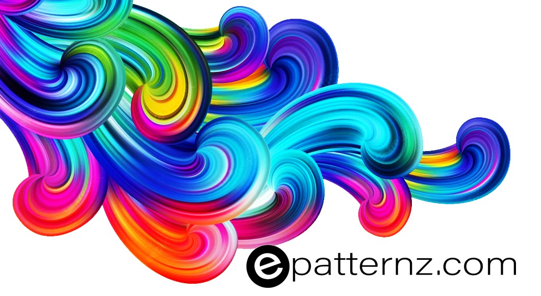
At epatternz.com, we encourage designers to experiment with color and explore its endless possibilities. Whether you’re a seasoned professional or just starting out, mastering color theory will enhance your ability to create stunning, impactful designs.
 Epatternz